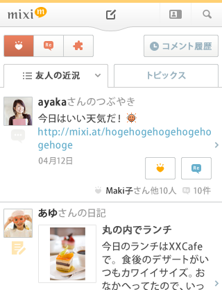
Mixi today announced it has redesigned Mixi Touch, its mobile site optimized for touch-control smartphones. This isn’t groundbreaking news, but fairly important for Mixi, whose smartphone offering has been growing quickly in recent months.
The main change can be seen on the splash page, from which Mixi users can now leave feedback more easily (for example comments or likes). And the home screen is now definitely “longer”, meaning it now takes a while to scroll from top to bottom to check your Mixi friends’ activities, check-ins, snippets of diary entries, community news etc. etc.
Screenshots:


